Hello! I'm Evgenia Fomicheva. I’m a brand designer and graphic designer, combining strategic insights and creativity to create branding, packaging design,
and graphic design.
and graphic design.
✎ selected work
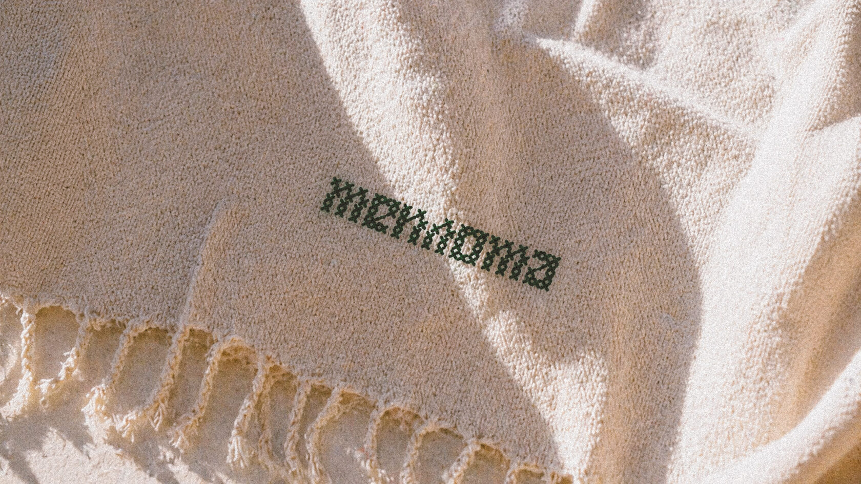
ТЕПЛОТА
2026 / Soft Bedding and Pajamas
Branding, Packaging Design, Naming
Branding, Packaging Design, Naming

⨯ close

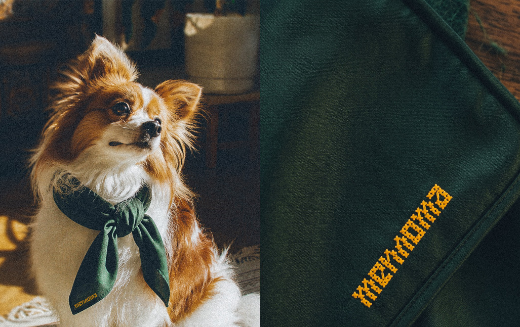
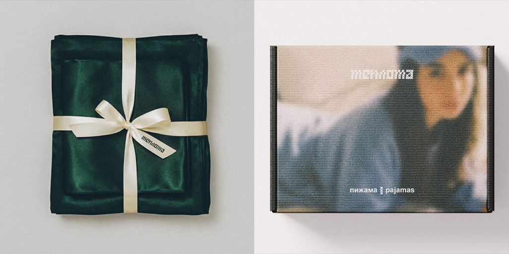
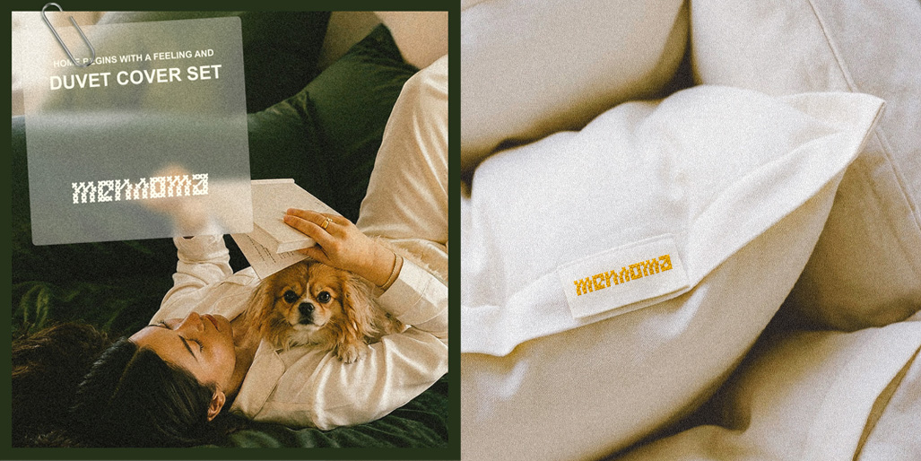
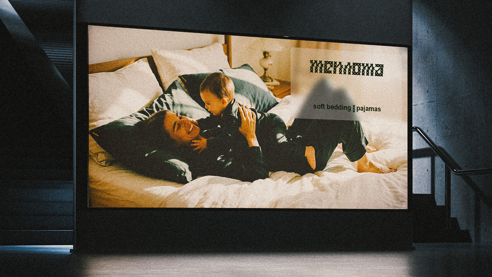
Teplota (warmth) is an eco + multi-functional soft bedding and pajama brand that turns the everyday into the personal, filled with coziness, comfort, and a sense of warmth.
Home begins with a feeling
The brand's philosophy has been shaped by a multitude of details, accents, and values: such as attention to quality, functionality, and aesthetics, alongside care, love, freedom, tenderness, and most importantly, the opportunity to create your own soft world around you. This is a lens for everything the brand does: how it behaves, sounds, feels, and welcomes you.
The brand identity is built around the brand's philosophy, blending warm and natural colors, lightness and softness to create an overall sunny and warm feeling. The logo mimics cross-stitch embroidery: an archetype of home warmth and a sign of the attention and time invested in an item, thereby reflecting the brand's values and philosophy. The symbol scales to any medium while remaining true to itself: recognizable, warm, and subtly personal.
Теплота — eco + multi-functional бренд постельного белья и пижамы, который превращает повседневное в личное, наполненное уютом, комфортом и чувством тепла.
Дом начинается с ощущения
Философия бренда сформировалась из множества деталей, акцентов и ценностей: таких как внимание к качеству, функциональности, эстетики, заботы, любви, свободы, нежности, а главное возможности создавать вокруг себя свой мягкий мир. Это служит линзой для всего, что делает бренд, как себя ведет, звучит, ощущается и приветствует вас.
Фирменный стиль строится вокруг философии бренда, соединяя теплые и природные цвета, легкость и мягкость, плотные и легкие материалы, создает общее солнечное и теплое ощущение. Логотип имитирует вышивку крестиком, архетип домашнего тепла, знак внимания и времени, вложенного в вещь, тем самым отражает ценности и философию бренда. Знак масштабируется на любой носитель и остаётся собой — узнаваемым, тёплым и чуть личным.


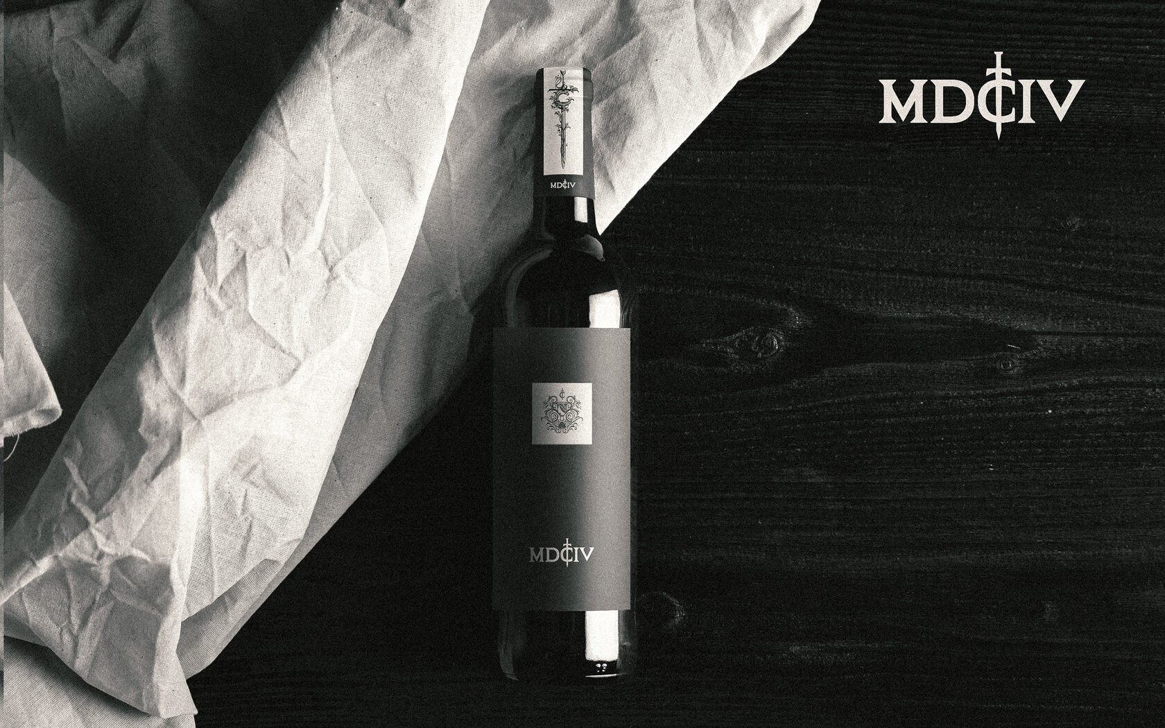
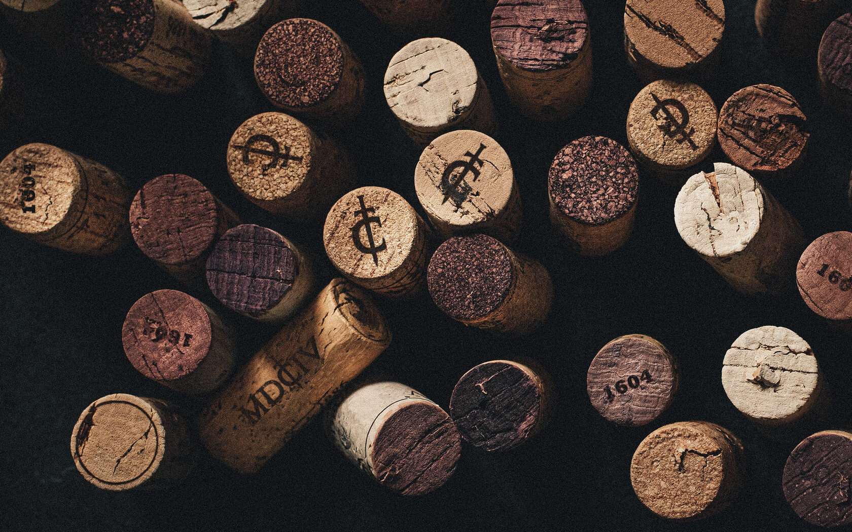
MDCIV / 1604
2023 / Personal Project
Branding, Packaging Design, Illustration, Naming
Branding, Packaging Design, Illustration, Naming

⨯ close

In this personal project, I wanted to combine and reflect art and history related to winemaking on the wine label while keeping the design minimalistic.
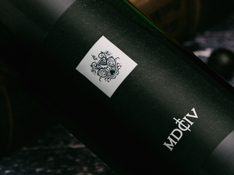
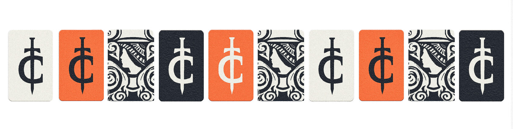
The project combines several elements of art and design: an illustration of an ancient Greek amphora, Gothic lettering and Roman numerals, and the overall appearance of the label which resembles a framed estampe in a passe-partout.
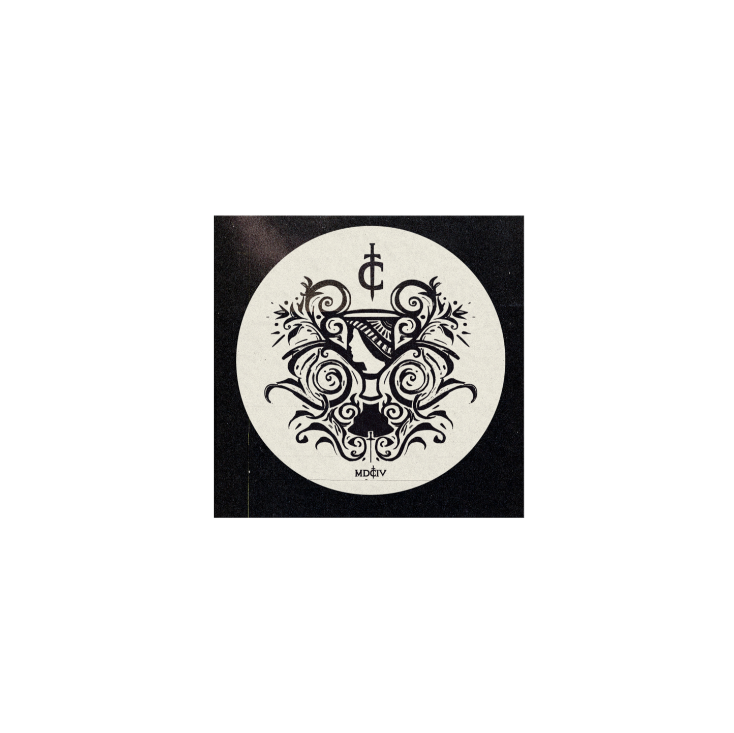
The illustration combines elements of modern culture with the heritage of the ancient world. The image shows the silhouettes of a glass and
an amphora, an ancient vessel used to store wine, among other things. Amphorae usually depicted figures, less often faces, but since the illustration was supposed to be small in size, it was decided to emphasize the face and the ornament, which rhythmically repeats the silhouette of the amphora and the brand logo.
The project combines several elements of art and design: an illustration of an ancient Greek amphora, Gothic lettering and Roman numerals, and the overall appearance of the label which resembles a framed estampe in a passe-partout.
The illustration combines elements of modern culture with the heritage of the ancient world. The image shows the silhouettes of a glass and
an amphora, an ancient vessel used to store wine, among other things. Amphorae usually depicted figures, less often faces, but since the illustration was supposed to be small in size, it was decided to emphasize the face and the ornament, which rhythmically repeats the silhouette of the amphora and the brand logo.
В этом персональном проекте мне хотелось совместить и отразить на этикетке вин: искусство и историю, связанные с виноделием при этом сохраняя лаконичный дизайн.
В проекте сочетаются несколько элементов искусства и дизайна: иллюстрация древнегреческой амфоры, готическое начертание шрифта и римские цифры, общий вид этикетки, напоминающий оформленный эстамп в паспарту.
Иллюстрация соединяет элементы современной культуры с наследием древнего мира. На изображении представлены силуэты бокала и амфоры, античного сосуда для хранения, в том числе, вин. Обычно на амфорах изображали фигуры, реже лица, но поскольку иллюстрация предполагалась небольшого размера, то было решено подчеркнуть лицо и орнамент, ритмично повторяющий силуэт амфоры и фирменный знак.

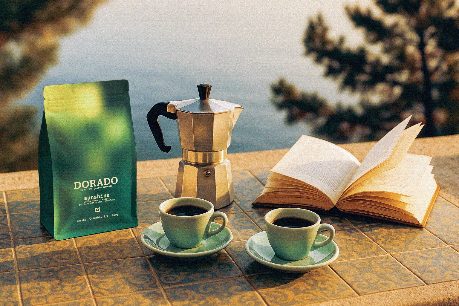
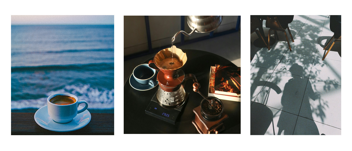
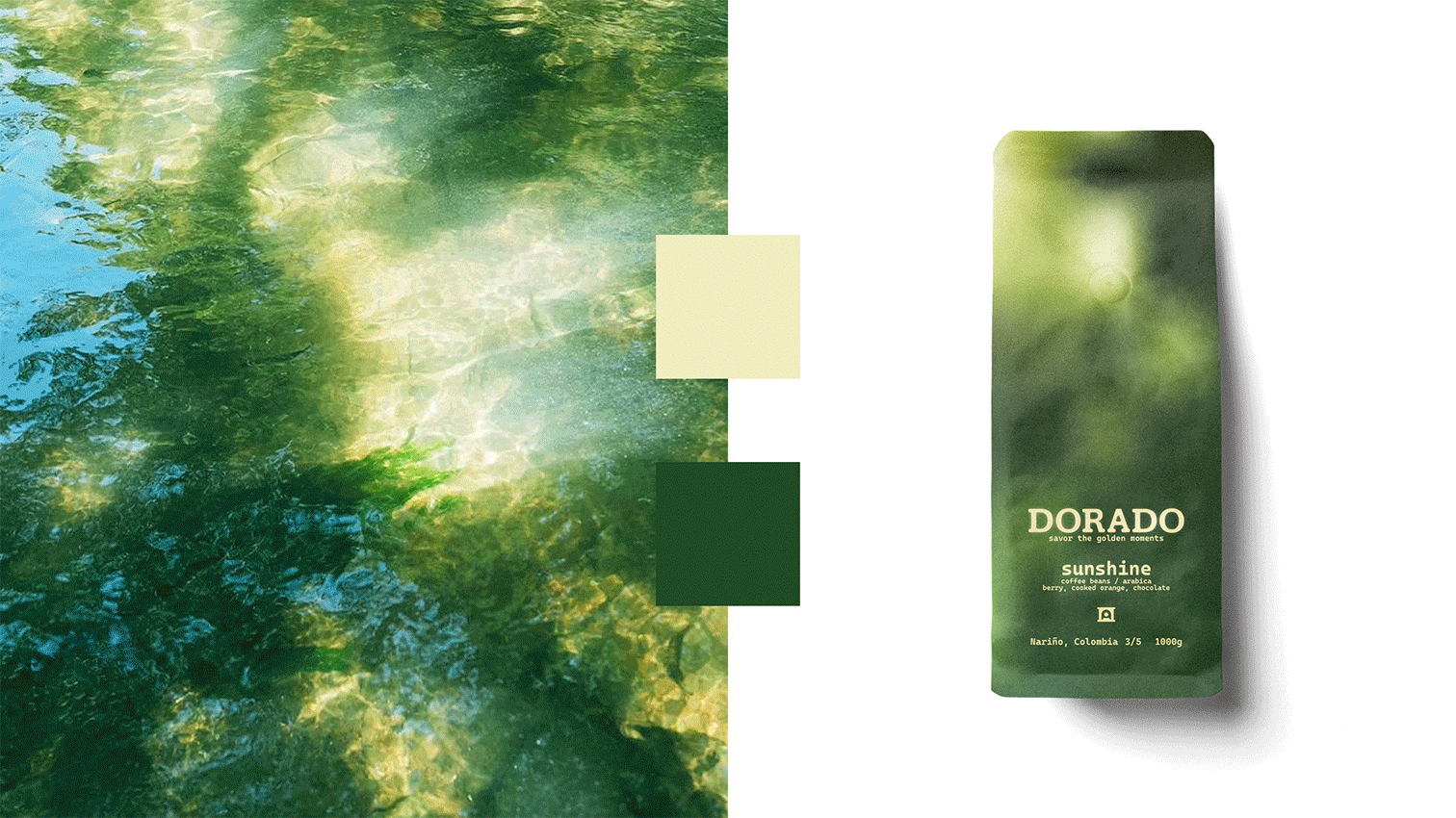
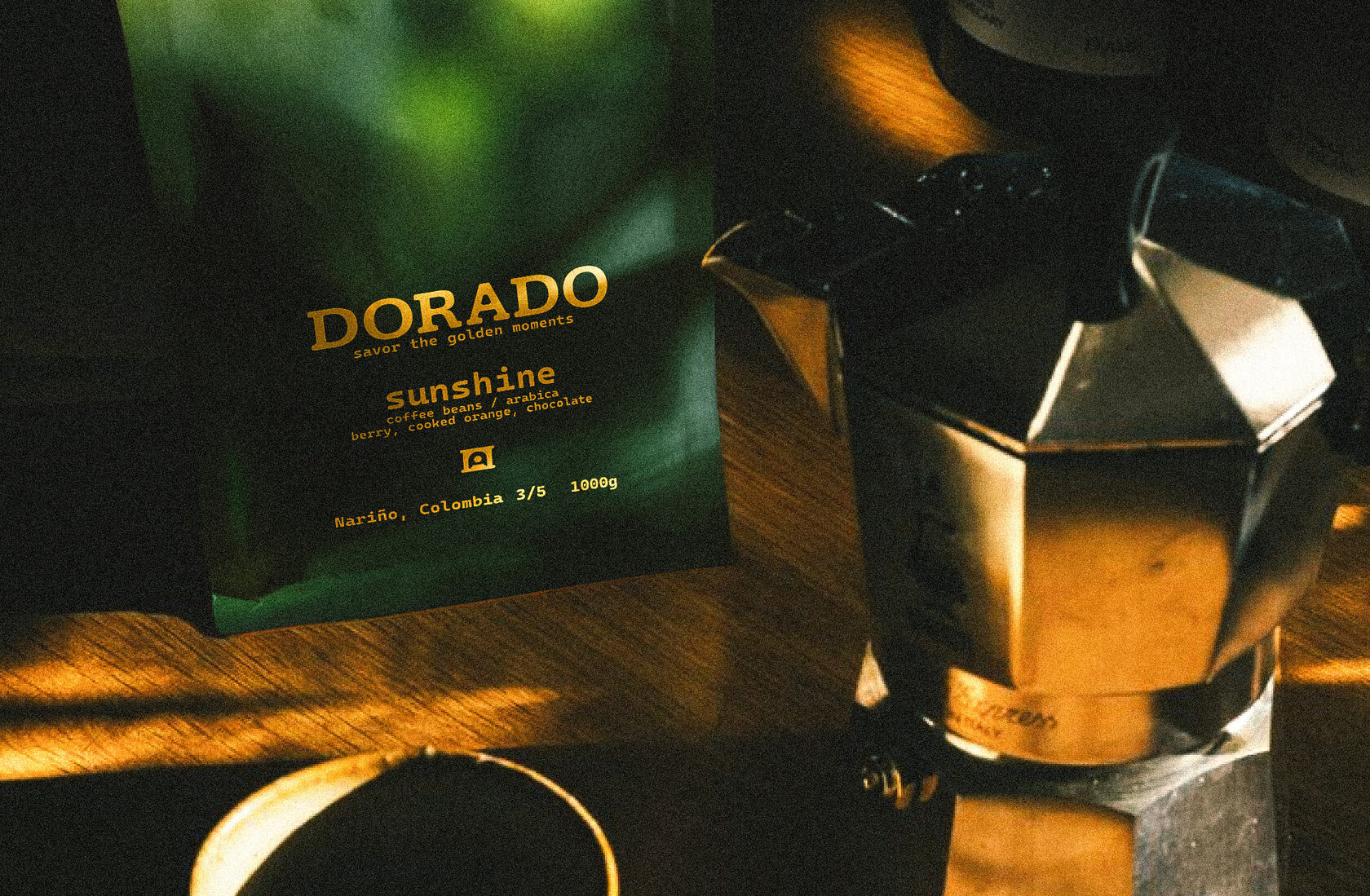
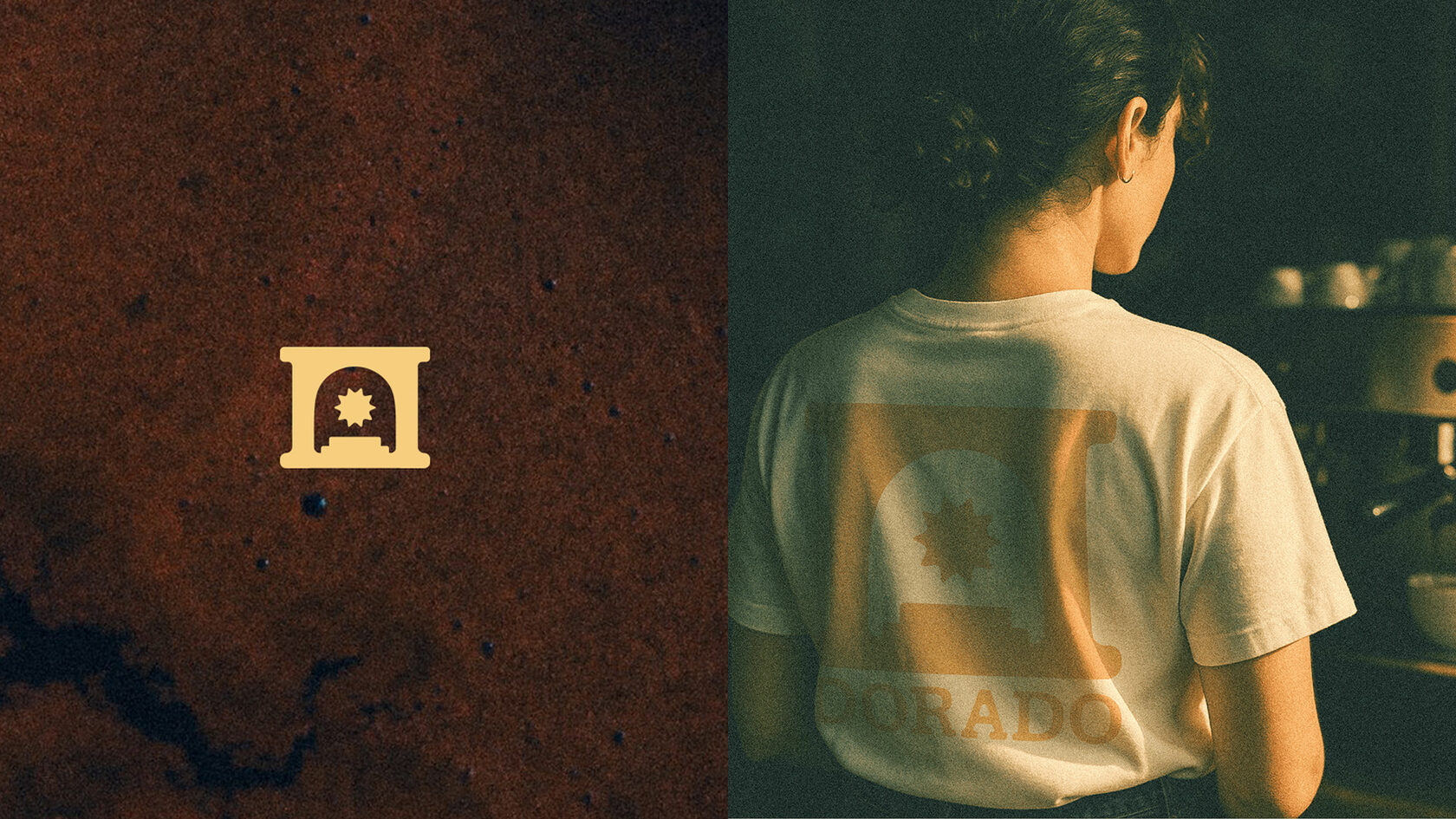
DORADO
savoring the golden moments
2025 / Beverage
Brand Platform, Brand Identity, Packaging Design

⨯ close
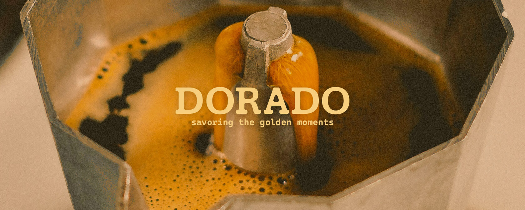
Dorado is a coffee brand with blended flavors — berries, chocolate, fruit and more. The challenge of the project was to emphasize complexity of flavors, combine it with brand identity, and keep the differentiation in the market.
The market has many different coffee options and most of them are about energy or quality that is reflected in their design. But not many coffee brands speak in the language of experience. The insight: people who choose complex flavors are want to enjoy the flavor and the moment.
savoring the golden moments
The concept reflects the key brand idea and transforms flavors into color gradients, symbolizing an unfolding taste reminiscent of a blooming spring garden, the aroma of ripe fruits, caramel, chocolate, or cookies. The logo draws from the name itself. Dorado — a mythical place that is very close, becoming a metaphor for the perfect moment.
Dorado — кофейный бренд с бленд-вкусами: ягоды, шоколад, фрукты и другие вкусы. Задача проекта: подчеркнуть сложность вкусовых комбинаций, объединить их с айдентикой и сохранить отличие от других брендов на рынке.
На рынке представлено множество кофейных брендов, и большинство из них про энергию или качество кофе, и это отражается в их дизайне. Но немногие бренды говорят на языке опыта и ощущений. Инсайт: люди, которые выбирают сложные вкусы — хотят насладиться вкусом и моментом.
savoring the golden moments
Концепция отражает ключевую идею бренда и превращает вкусы в цветовые градиенты, символизируя раскрывающийся вкус, напоминающий цветущий весенний сад, аромат спелых фруктов, карамели, шоколада или печенья. Логотип отсылает к самому названию. Dorado — мифическое место, которое совсем рядом, становится метафорой идеального момента.

⨯ close
Hi, I'm Evgenia but I go by Jenna. I’m a brand designer with 6+ years of experience in graphic design and branding, combining strategic insights and creativity to create branding, packaging design, and graphic design.
3+ years of experience in digital illustration, creating conceptual illustrations, storyboards, concept art to convey story and mood through color and story in illustrations for brands, books, and games.
Education
Bachelor's degree in Graphic Design / Pacific National University / 2017
Languages: Russian (native) / English (B2)
Selected Courses / Coursera
Brand Management: Aligning Business, Brand and Behaviour / University of London & London Business School / 2024
Foundations of Strategy / IE Business School / 2023
Brand Identity and Strategy / IE Business School / 2023
Modern and Contemporary Art and Design / MoMA / 2021
For work collaboration or any further information, please contact me at
⤷ evgeniya.fomichevaa@gmail.com
⤷ LinkedIn
Open to relocation
3+ years of experience in digital illustration, creating conceptual illustrations, storyboards, concept art to convey story and mood through color and story in illustrations for brands, books, and games.
Education
Bachelor's degree in Graphic Design / Pacific National University / 2017
Languages: Russian (native) / English (B2)
Selected Courses / Coursera
Brand Management: Aligning Business, Brand and Behaviour / University of London & London Business School / 2024
Foundations of Strategy / IE Business School / 2023
Brand Identity and Strategy / IE Business School / 2023
Modern and Contemporary Art and Design / MoMA / 2021
For work collaboration or any further information, please contact me at
⤷ evgeniya.fomichevaa@gmail.com
Open to relocation
Reverie
the moment
2023 / Lifestyle / Fragrance
Brand Platform, Brand Identity, Packaging Design, Naming

⨯ close
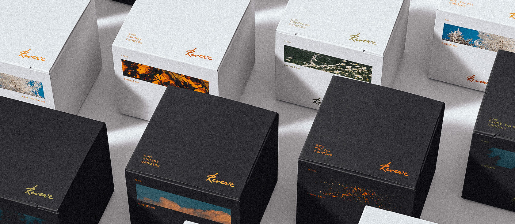
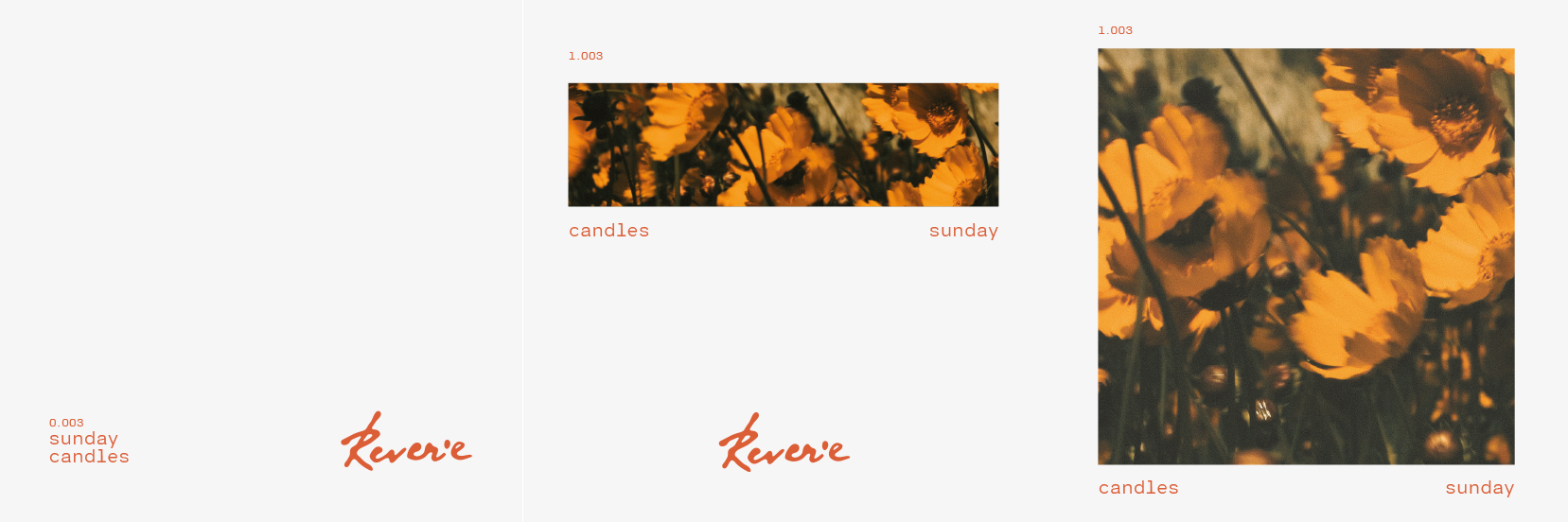
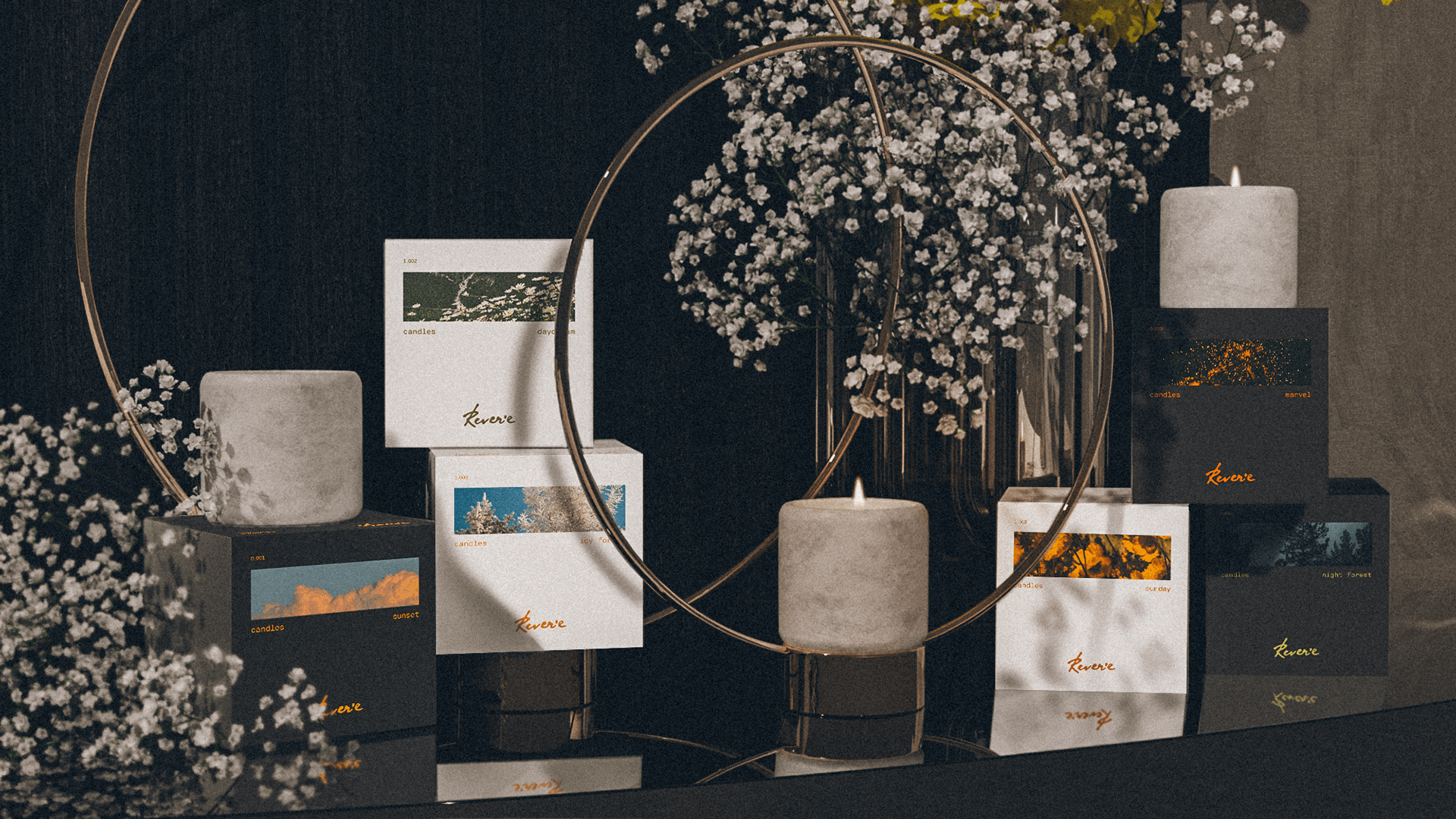
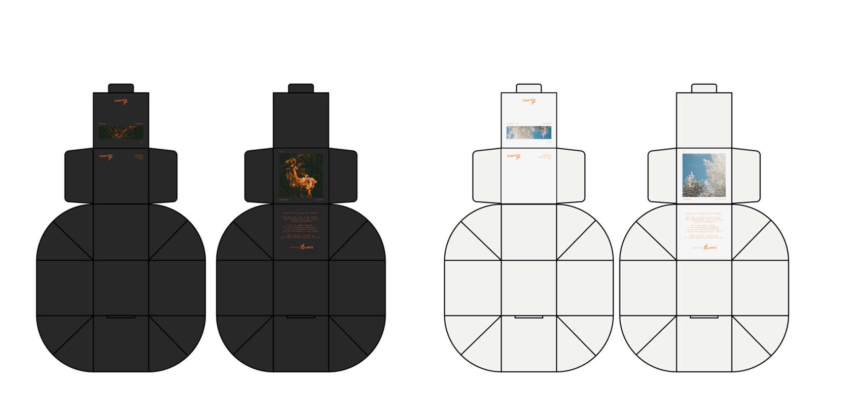
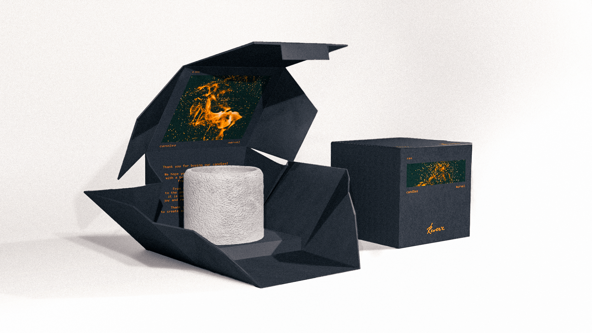
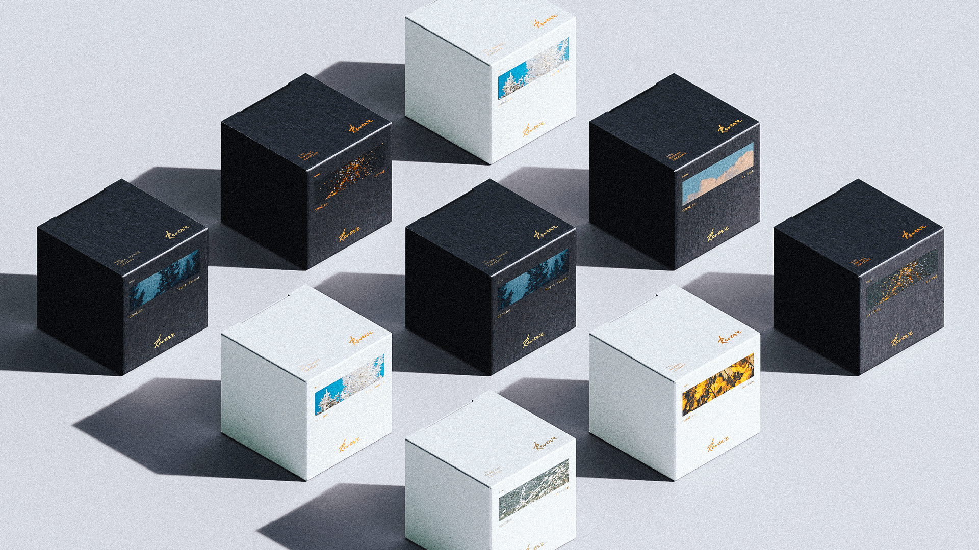
Reverie is a candle brand featuring a diverse range of scents inspired by the natural world. The challenge of the project was to develop the brand identity and packaging design.
In the scented candle segment, there are many sweet and perfume-based compositions, but fewer fragrances that convey natural, nature-inspired associations. Or their scent doesn't always come across as sufficiently authentic. Insight: People who choose scented candles most often want to create a cozy atmosphere and take some time for themselves.
the moment
The key idea of the brand is to help create that special moment for yourself. This is also reflected in the brand identity metaphor through a Polaroid frame capturing the associations of the fragrance's key notes. Handwritten-style logo, extends the connection to that frame, like a moment you want to keep.
Reverie, бренд свечей с разнообразными ароматами, напоминающие природные ароматы. Задача проекта: создать брендинг и упаковку.
В сегменте ароматических свечей много сладких и парфюмерных композиций, но меньше ароматов, которые передают естественные природные ассоциации или их аромат не всегда звучит достаточно естественно. Инсайт: люди, выбирающие ароматические свечи чаще всего хотят создать уют и уделить время себе.
the moment
Ключевая идея бренда заключается в том, чтобы помогать создавать тот самый момент для себя. Это же отражается в метафоре айдентики бренда через кадр полароида, на которых запечатлены ассоциации ключевых нот аромата. Логотип, выполненный в рукописном стиле, продолжает ассоциацию с кадром, как мгновение, которое хочется сохранить.
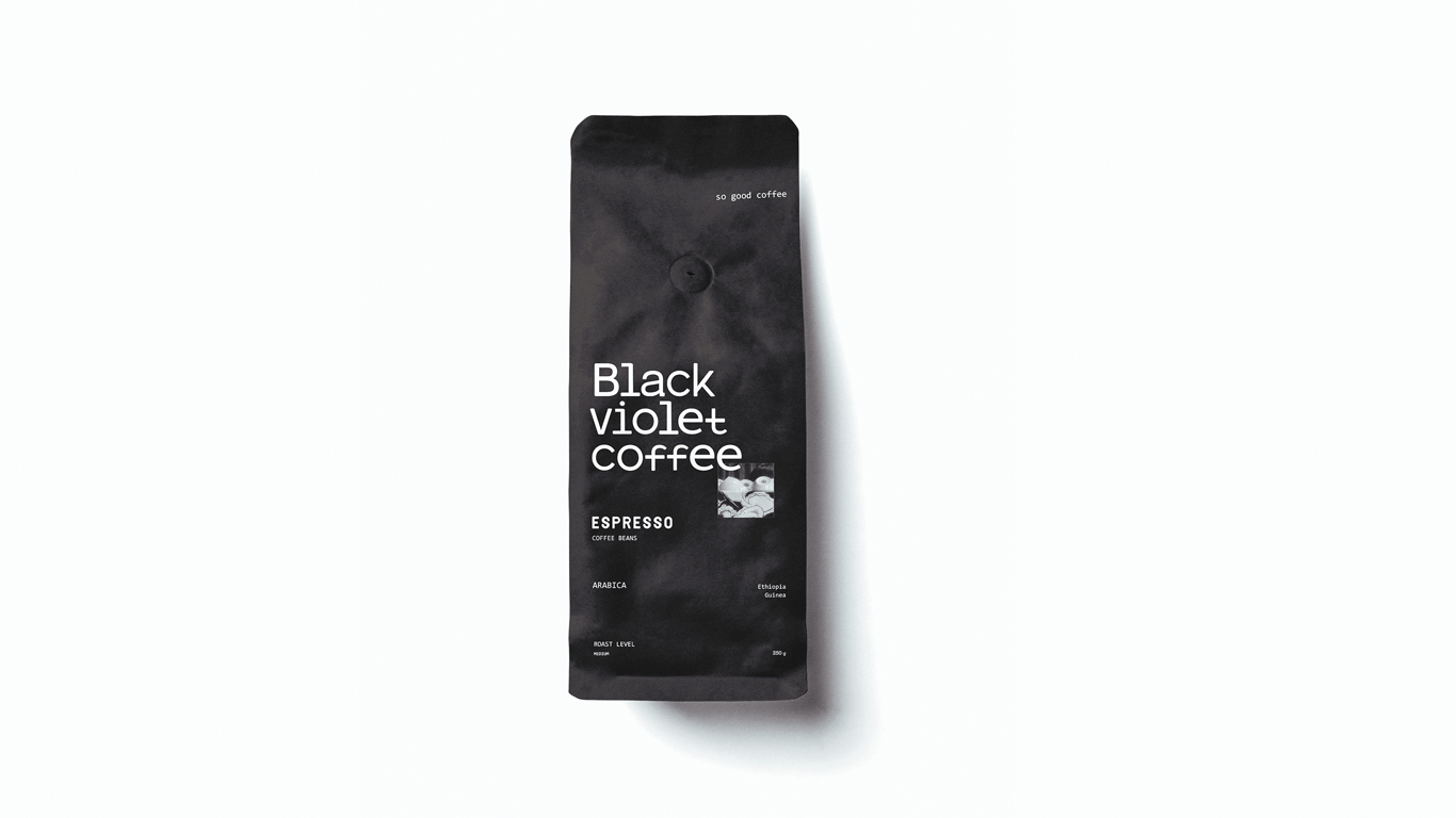
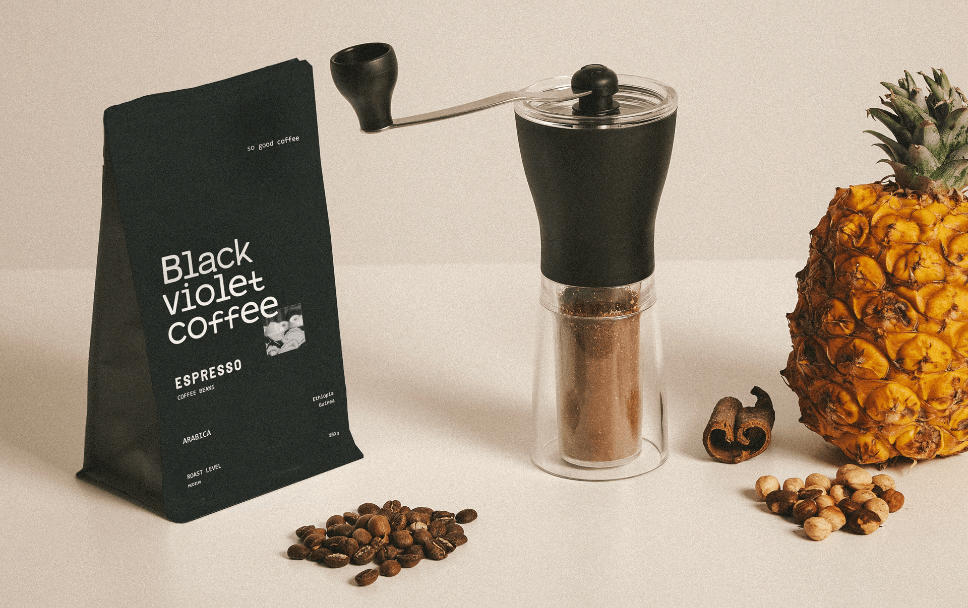
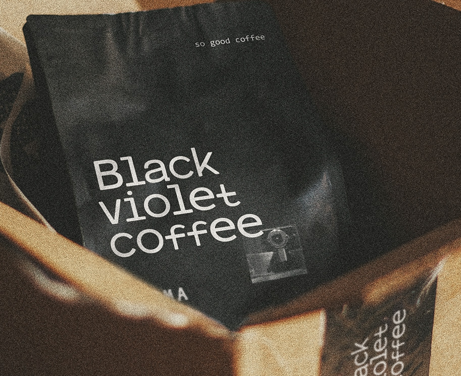
BLACK VIOLET COFFEE
home coffeehouse
2022 / Beverage
Brand Identity, Packaging Design

⨯ close
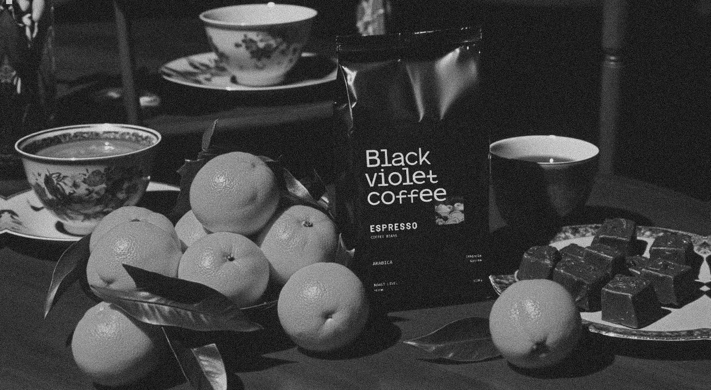
Black Violet Coffee is a new brand of coffee where coffee is more than just a drink. It represents a love for coffee, the aroma of freshly ground beans, and the delicate taste of the beverage. It’s a morning ritual and a source of inspiration — a way to recreate your favorite coffee shop experience at home and brew coffee just the way you like it, whether it’s a rich espresso, a creamy cappuccino, or a classic Americano.
Home Coffeehouse: Black Violet Coffee
In this project, we aimed to move away from the typical associations with "energy" and instead highlight coffee-making as a ritual — a slow process free from distractions.
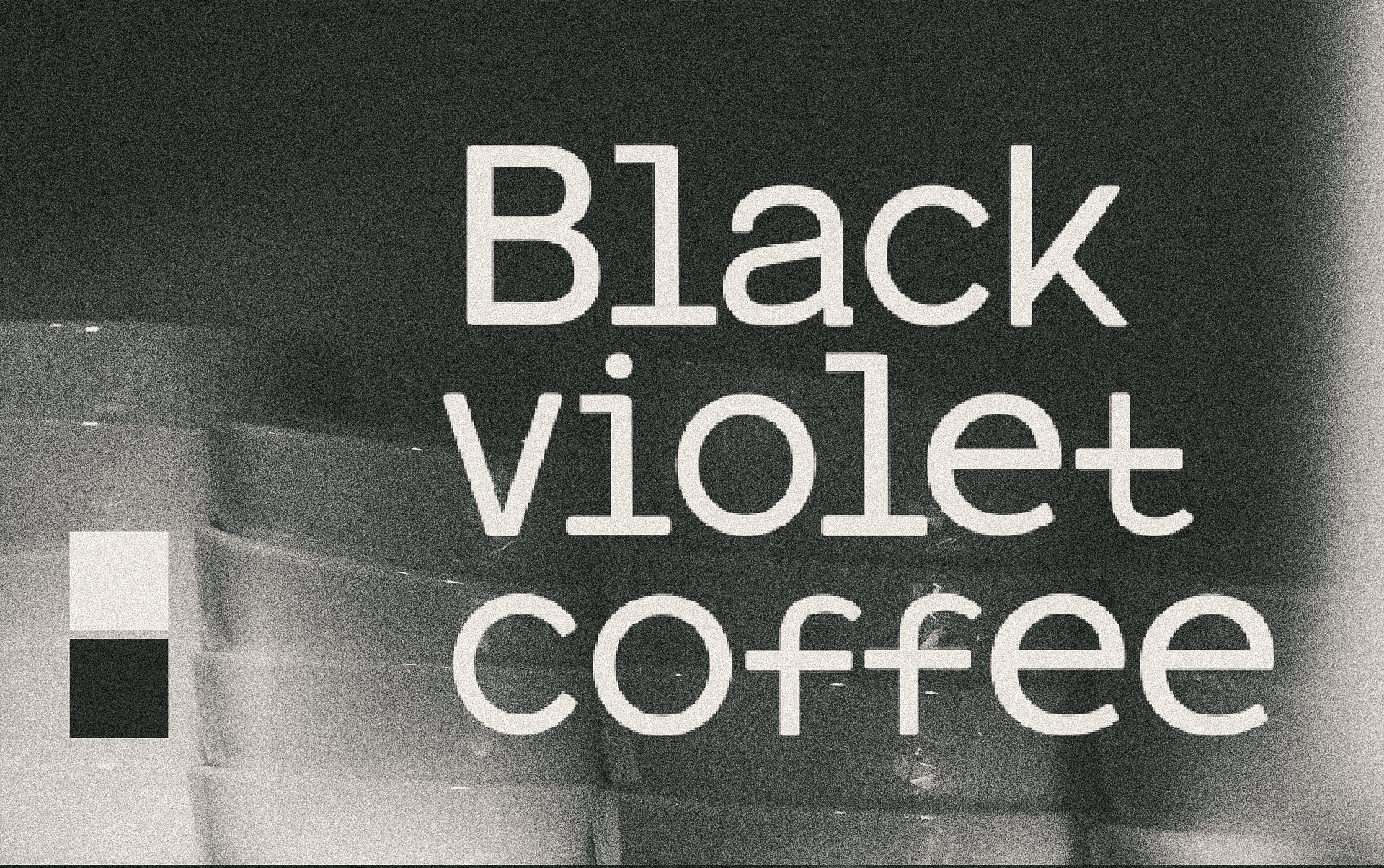
The brand identity of Black Violet Coffee is inspired by the metaphor of a coffee shop. The primary color palette features black, symbolizing a chalkboard, and white, representing chalk. The fonts evoke the look of handwritten block letters, reinforcing the connection to chalkboards commonly seen in coffee shops. This approach reflects the brand's core values: a love for coffee and a focus on quality.
Home Coffeehouse: Black Violet Coffee
In this project, we aimed to move away from the typical associations with "energy" and instead highlight coffee-making as a ritual — a slow process free from distractions.
The brand identity of Black Violet Coffee is inspired by the metaphor of a coffee shop. The primary color palette features black, symbolizing a chalkboard, and white, representing chalk. The fonts evoke the look of handwritten block letters, reinforcing the connection to chalkboards commonly seen in coffee shops. This approach reflects the brand's core values: a love for coffee and a focus on quality.
Black Violet Coffee — это новый бренд зернового кофе, где кофе — больше, чем просто напиток. Это любовь к кофе, к аромату только что помолотых зерен и нежному вкусу напитка. Это утренний ритуал и источник вдохновения, способ воссоздать атмосферу любимой кофейни у себя дома и приготовить кофе так, как вы любите, будь то насыщенный эспрессо, нежный капучино или классический американо.
Home Coffeehouse: Black Violet Coffee
В этом проекте стремились отойти от привычных концептов “бодрости”, и показать, что приготовление кофе может быть ритуалом — неспешным процессом.
Айдентика бренда Black Violet Coffee вдохновлена метафорой кофейни. Основная цветовая палитра включает черный цвет, символизирующий доску для рисования мелом, и белый цвет, ассоциирующийся с мелом. Шрифты напоминают написанные от руки печатные буквы, что усиливает связь с меловыми досками, часто встречающимися в кофейнях. Этот подход отражает ключевые ценности бренда: любовь к кофе и внимание к качеству.